


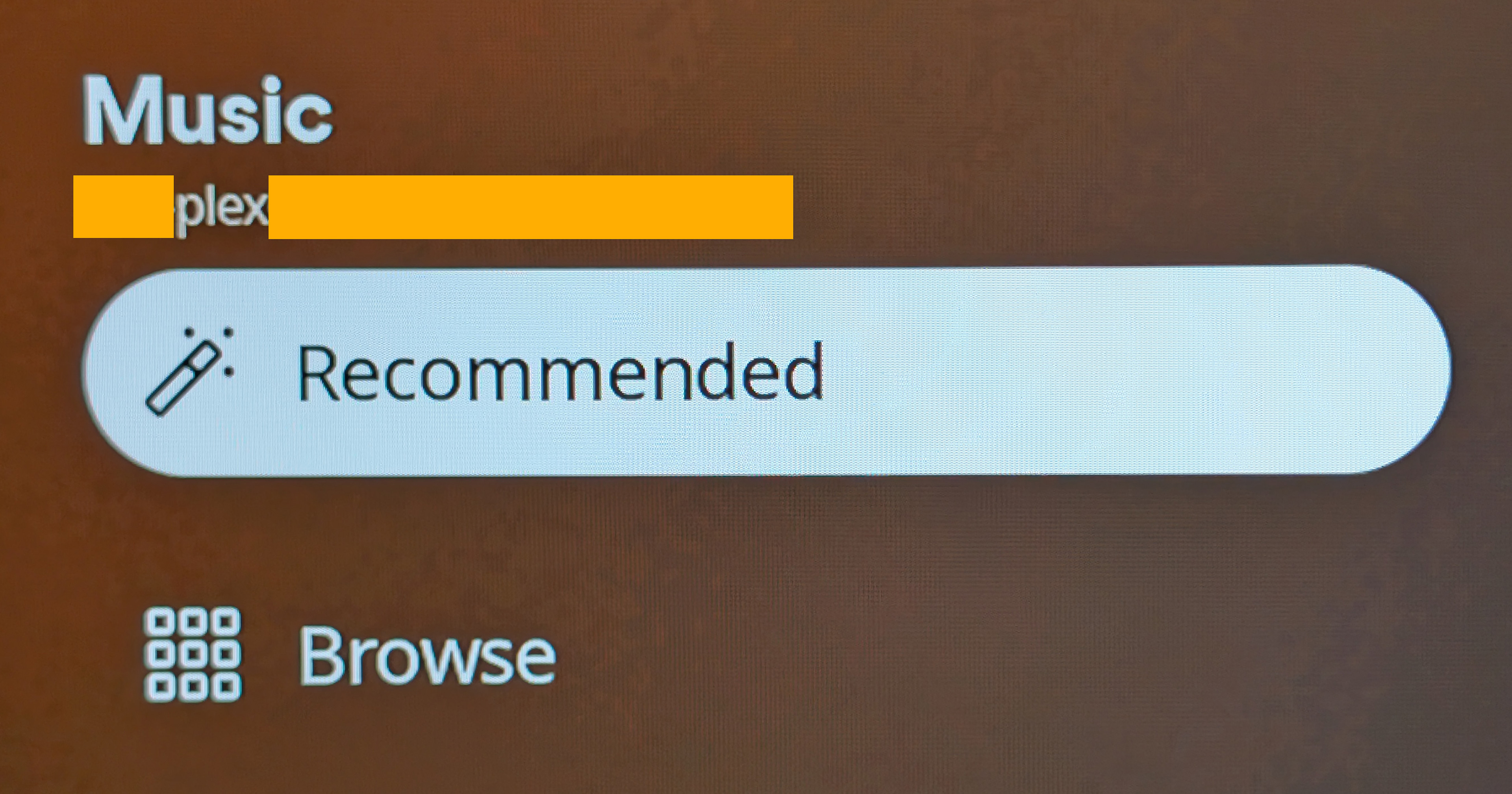
One button in the relatively new Plex client for Roku exemplifies everything that’s wrong with Plex’s current approach to its business model and customers.
Looking at that “screenshot”, you might wonder what I’m on about. It seems perfectly normal. It might even leave you scratching your head as to why it could ever be a problem.
It’s not just that button: The entire Roku app is awful. Among other things, it now forces your home screen to present Plex-corporate-specific-content, and buries your own libraries in a very irritating menu at the top of the screen.
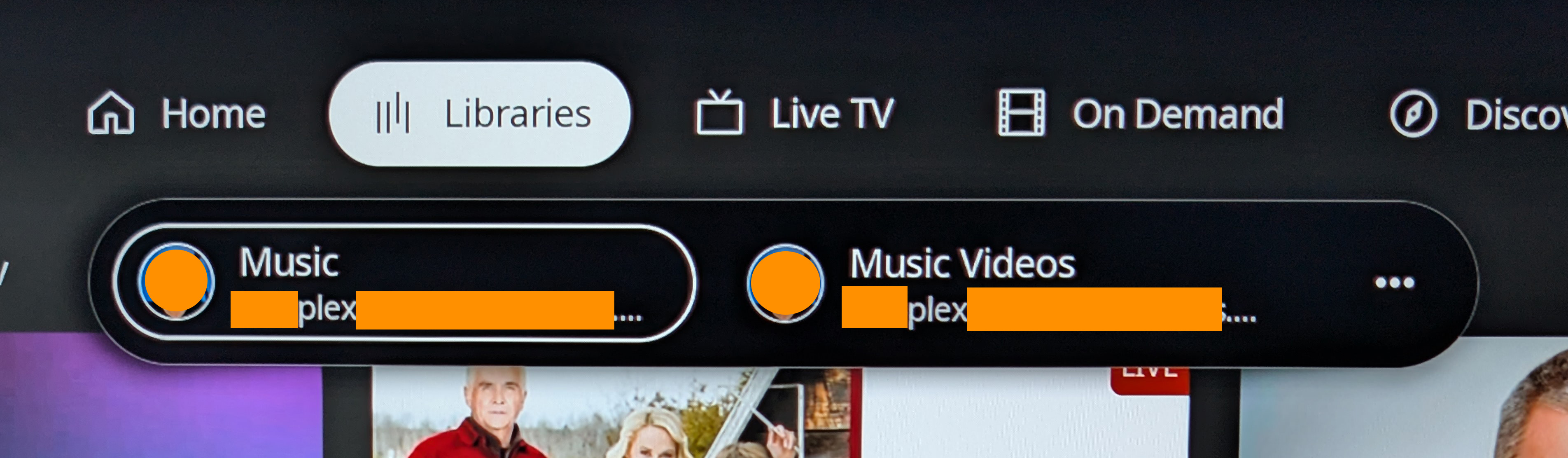
The library selection menu. Imagine if there were 10 libraries here. I pared it down to the two I use most to cut down on button presses.
From a UX perspective, it’s horribly optimized (or not optimized at all) for quick and easy navigation. The prior version of their Roku app wasn’t perfect, but Plex is clearly aiming for a use case other than consuming one’s own content.
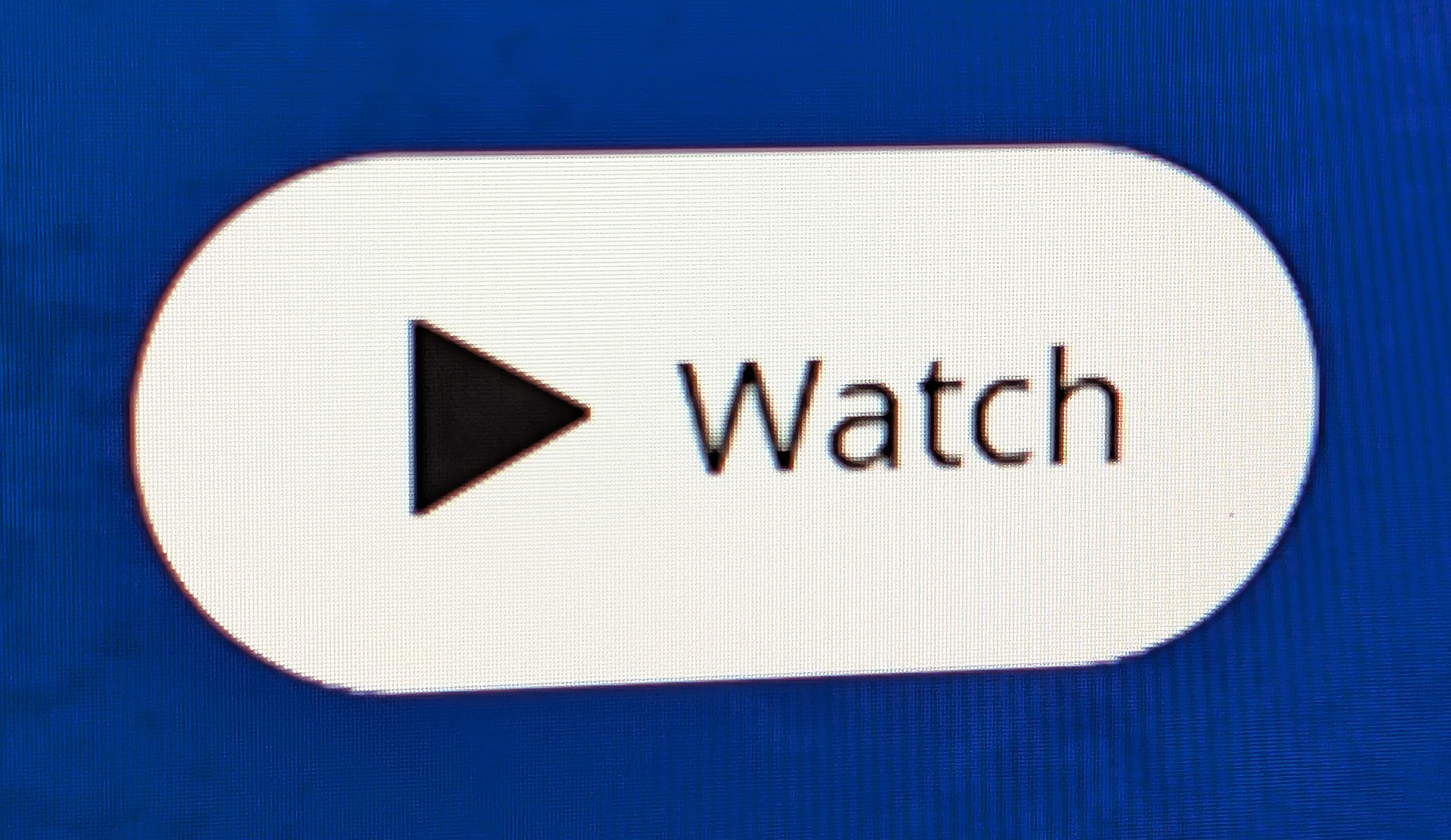
So let’s look at that button again, and compare it to the button on the Plex web interface:

Watch versus Play.
One of those words is the app telling you what to do (watch), while the other is you telling the app what to do (play).
Yep, that’s it. That’s the reason for my annoyance. It emphasizes their philosophy: Plex will now order you around, rather than being ordered around by the user.
You want to watch your own media libraries? Buried. Watch Plex-branded monetized content instead.
Play means “commence presenting the media”. Yet, Plex feels confident enough to redefine it as watch.
However, I often don’t watch visual media. Sometimes I just have it on in the background and I listen. But I’ve always starting it playing by pressing the play button.
Sometimes I leave the room while something is playing, even though I’m no longer watching.
So not only is the button labeling instructive rather than receptive, it’s also just plain wrong in common use cases.
On top of that, it’s unnecessary.
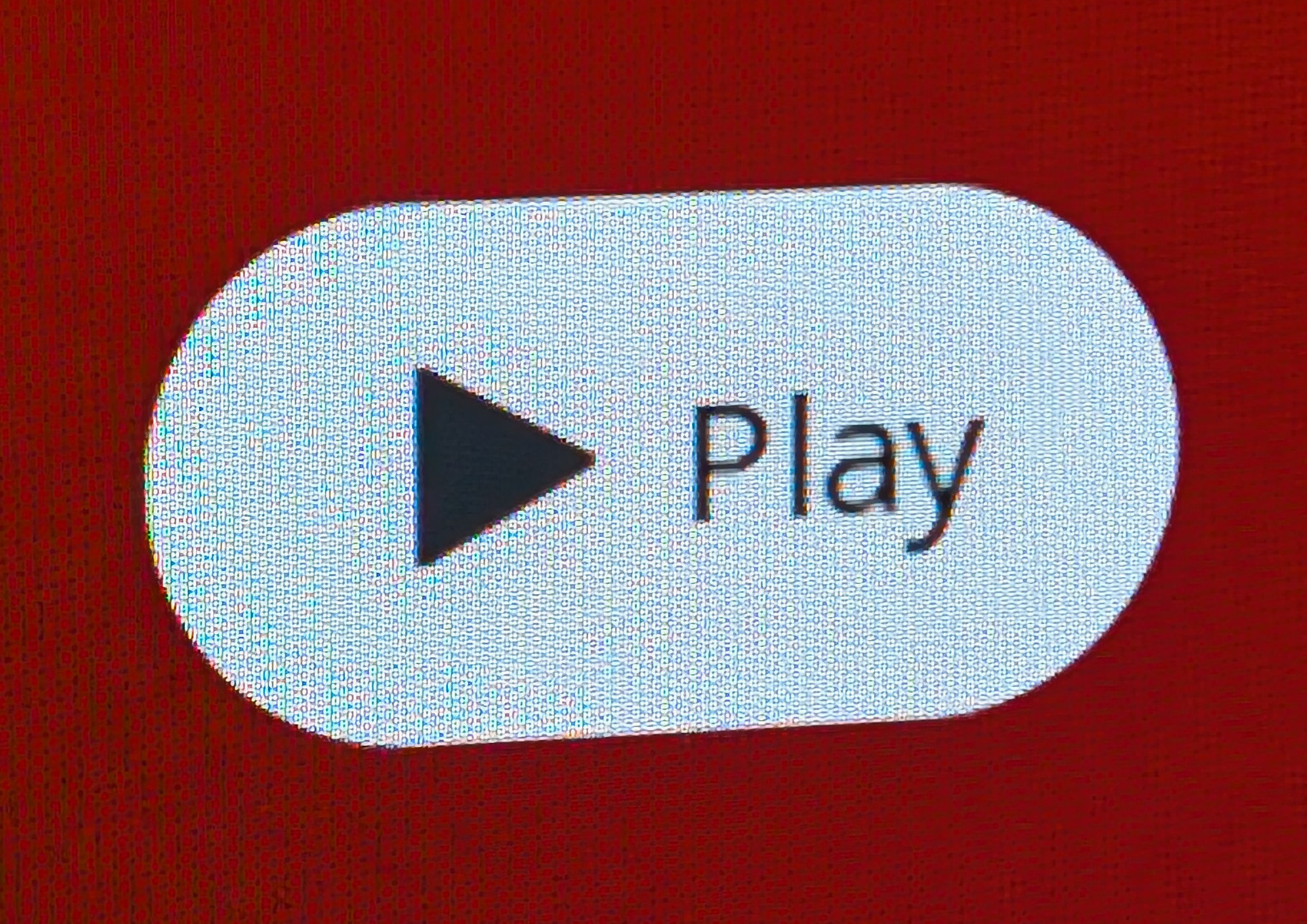
Obviously this is a “play” icon, identifiable even in a logo.
The sideways equilateral triangle pointing to the right is universally understood to mean “play”, across just about all languages and cultures of Earth. Why Plex bothers to label the button is strange, as perhaps their time could be better spent on other areas.
Sure, it doesn’t take a lot of time to label a button, but probably more than you’d think.
Aside from the fact that their codebase needs to contain what are ultimately pointless conditionals to decide whether “watch” or “play” should be shown depending on the type of media, there’s also localization. A simple play icon by itself needs no localization.
But the text accompanying it must be made available in every language supported by the Plex app. Adding text to a universal symbol is just wheel spinning. Moreso when that text actively redefines the meaning of the symbol.
Bizarrely, in a music library, the button isn’t labeled “Listen”. No, it simply says “Play”.
Not only is Plex wrong (IMO) in their button labeling, they’re also inconsistent.
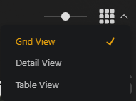
Getting back to iconography, there’s these gems on the left-hand side of the interface. If you’ve never seen them in this context, try and conjure in your mind what they might do in reference to your media library before you scroll any farther:
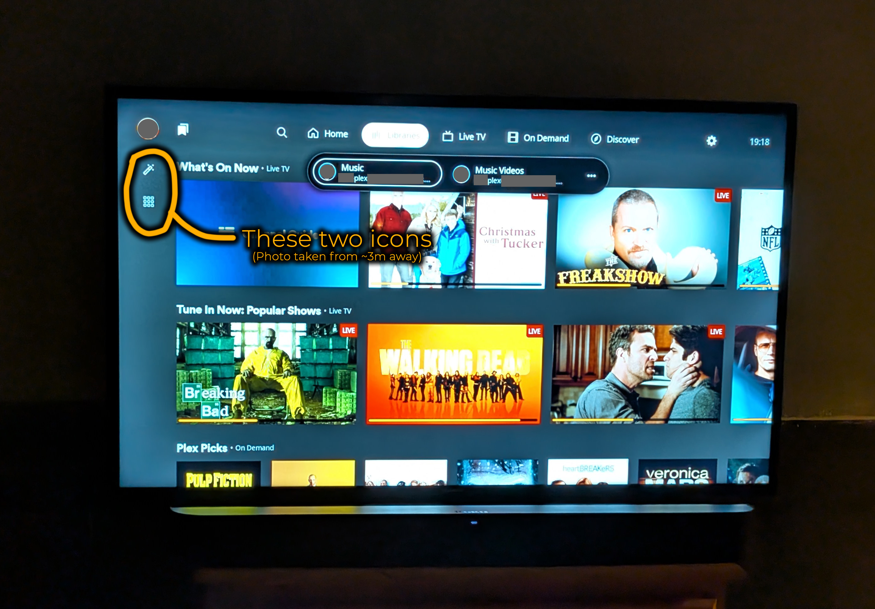
That top one? I thought it was an eyedropper icon at first, viewing a 2160p 42″ screen from perhaps 3 meters away as I was.
Nope. That’s intended to be a magic wand.
Or rather, I think it’s meant to be a magic wand. It’s a bit oddly proportioned, the top segment isn’t filled in with white as with a stereotypical magic wand, and the spacing of the “magic radiance dots” is too uniform. (Perhaps 4 dots would be better?)
The bottom icon is clearly a grid, which I suppose is at least recognizable. Though, a grid of what? And magic for what?
![]()
I polled a few people around the office, showing them an image of the entire screen. No one could correctly identify the purpose of either icon, even in context.
Fortunately, hovering over the icons reveals their purposes:
My question here is: Why persistently label something obvious like the play icon, yet create two extremely vague icons and leave them unlabeled by default?
What’s even more baffling is that the Plex web interface uses a very similar icon to the “Browse” above, yet for a completely different purpose. The grid is used to represent — get this — a grid view. That makes sense.
All design issues aside (and there are more — I’m still on the home screen at this point!) there are major bugs in the Plex Roku app.
For example, twice today the interface froze while I was listening to music. (I use the Roku when working out.) In both instances, it occurred when I was navigating between albums under a couple of different artists. Not selecting anything, mind you. Simply using the arrow buttons on the remote was enough to freeze the UI.
And it was just the UI; Music was still playing, and hitting the remote’s Home button brought me back to the Roku home screen to re-launch the Plex app, indicating that the Roku OS hadn’t seized up. (I was able to reproduce that problem on a completely different type of Roku device, so it’s almost certainly an app bug and not specific to my one device.)
Tonight, when launching the Plex app to get the above screenshots, it greeted me with a black screen. Oh, the volume keys on the remote still worked and the volume indicator popped up on screen. The Roku home button worked. The Plex app did not.
I never had those kind of problems on the old, better Plex app.
In conclusion, my take is this:
Plex initially went in with a very consumer-friendly business model, offering lifetime subscriptions at a reasonable price. This, though great for me and many others, was clearly unsustainable. There’s a certain addressable market for personal media server subscriptions, and they probably addressed all of it.
Now, they want to become some kind of half-assed media company, pulling in revenue from wherever they can, forcing their existing customers deeper and deeper into the Plex content ecosystem. A place none of their users want to be. This is also an unsustainable business model, but meanwhile they’re spending significant money on re-developing all their beloved apps, removing valuable features and rendering others inconvenient.
Why, oh why, do I need 2 different apps on my phone for music and video? Often when listening to music, I’ll play the music video when that’s available and otherwise listen to the MP3/FLAC. It was great when that could be done within the same app. Now, not so good.
I’d move to Jellyfin, but Plex’s web interface is by far the best in the industry. And by “industry”, I don’t just mean that of personal media servers. Plex’s web interface is superior to any video streaming service out there, paid or otherwise*. They had a top design team at one point. Maybe they still do, but that team is being crippled by management. I have no way of knowing.
Jellyfin is (for now) very immature by comparison (though philosophically much, much better).
*Though I wager Plex’s web interface won’t be aces for long. It might even be enshittified by the time you read this. I’d promise to update this post to reflect that, but by the time they kill off this generation of the web interface, I won’t care about this anymore because I’ll be using something else. Probably Jellyfin.)
Of course, I only use Plex for my personal consumption of content which I purchased and ripped from my own hard media.